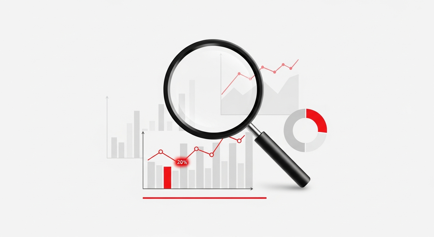
Most creators check their analytics wrong. They look at total views, feel good or bad about the number, and move on. That’s not analysis—that’s just looking at numbers.
Real analysis answers the question: “What should I do differently tomorrow based on what I learned today?”
In this guide, we’ll show you how to analyze your TikTok performance like a pro—identifying patterns, understanding what’s working, and building a data-driven content strategy.
The Analytics Framework: From Data to Action
Here’s the framework we recommend:
Data → Patterns → Insights → Actions → Results → (Repeat)Most creators stop at “Data.” They see their video got 50,000 views and think “nice!” without asking why. Let’s go deeper.
Part 1: Understanding Your Metrics
The Metrics That Actually Matter
Not all metrics are created equal. Here’s a hierarchy based on what actually impacts growth:
Tier 1: Algorithm Signals (Highest Impact)
Completion Rate The percentage of viewers who watch your entire video. This is the single most important metric for TikTok’s algorithm.
- Below 30%: Your content isn’t landing—review hooks and pacing
- 30-50%: Average performance
- 50-70%: Good—you’re doing something right
- Above 70%: Excellent—analyze what made this work
Average Watch Time How long people watch before leaving. For a 60-second video:
- Under 20 seconds: Hook problem or wrong audience
- 20-40 seconds: Content quality or pacing issue
- 40-50 seconds: Good retention
- 50+ seconds: Strong performance
Watch-Through Rate at Key Points What percentage of viewers make it to:
- 3 seconds: Hook effectiveness
- 50% of video: Content resonance
- 100%: Overall quality
Tier 2: Engagement Signals (Medium-High Impact)
Share Rate Shares indicate content people want to show others. Calculate: Shares ÷ Views × 100
- Under 0.5%: Content isn’t share-worthy
- 0.5-2%: Average
- 2-5%: Good viral potential
- Above 5%: Highly shareable content
Comment Rate Comments signal engagement depth. Calculate: Comments ÷ Views × 100
- Under 0.1%: Content doesn’t spark conversation
- 0.1-0.5%: Average
- 0.5-2%: Good engagement
- Above 2%: Highly engaging
Save Rate Saves indicate valuable, reference-worthy content. Calculate: Saves ÷ Views × 100
- Under 0.5%: Content isn’t “save-worthy”
- 0.5-2%: Average
- 2-5%: Valuable content
- Above 5%: Highly valuable (common for tutorials, tips)
According to TikTok’s Creator Academy, saves are increasingly weighted by the algorithm as they indicate genuine value.
Tier 3: Vanity Metrics (Lower Impact)
Total Views Good for ego, but doesn’t tell you much about quality. A video with 1 million views but 10% completion rate is performing worse than a video with 50,000 views and 80% completion.
Follower Count Important for brand deals and social proof, but follower growth rate matters more than absolute number.
Like Count The easiest engagement action. High likes with low comments/shares suggests passive consumption.
Where to Find These Metrics
TikTok Native Analytics: Creator Tools → Analytics → Content
Limitations:
- Only shows 7-60 days of data depending on metric
- Doesn’t calculate rates automatically
- No cross-video pattern analysis
Third-Party Tools like Noodle:
- Automatic rate calculations
- Historical data beyond 60 days
- Pattern recognition across videos
- Retention curve visualization
Part 2: The Weekly Analysis Ritual
Set aside 30 minutes every Sunday for this analysis routine:
Step 1: Review This Week’s Performance (10 min)
Pull up every video you posted this week. For each, note:
- Views
- Completion rate
- Best engagement metric (likes, comments, shares, or saves)
Create a simple table:
| Video | Views | Completion | Best Metric |
|---|---|---|---|
| Hook tutorial | 45K | 62% | Saves (4.2%) |
| Day in my life | 12K | 38% | Comments (0.8%) |
| Trend participation | 89K | 54% | Shares (3.1%) |
Step 2: Identify the Outliers (5 min)
Look for:
- Top performer: What did this video do differently?
- Worst performer: What went wrong?
- Unusual patterns: High views but low completion? Why?
Step 3: Diagnose Performance (10 min)
For your top performer, ask:
- What was the hook? (Write it down)
- What was the topic/format?
- What time did you post?
- What hashtags did you use?
- What made this resonate?
For your worst performer, ask:
- Where did viewers drop off? (Check retention curve)
- Was the hook weak?
- Did you deliver on the promise?
- Was it off-brand for your audience?
Step 4: Document Learnings (5 min)
Write 2-3 bullet points about what you learned this week:
- “Hooks that start with direct address outperformed questions”
- “Tutorial content gets 3x more saves than entertainment”
- “Posting at 7 PM outperformed 9 AM this week”
Keep these in a running document. Over time, you’ll build a playbook specific to YOUR content and audience.
Part 3: Content Pillar Analysis
Beyond individual videos, analyze your content pillars (categories/themes).
Setting Up Pillar Tracking
Categorize your content into 3-5 pillars. Example for a fitness creator:
- Workout tutorials (how to do exercises)
- Motivation/mindset (personal stories, tips)
- Nutrition tips (food, supplements, recipes)
- Day in my life (routine, behind the scenes)
- Trend participation (current challenges/sounds)
Monthly Pillar Review
At the end of each month, calculate average metrics per pillar:
| Pillar | Avg Views | Avg Completion | Avg Saves | % of Content |
|---|---|---|---|---|
| Workout tutorials | 35K | 58% | 3.8% | 40% |
| Motivation | 22K | 45% | 1.2% | 15% |
| Nutrition | 28K | 52% | 4.2% | 20% |
| Day in life | 18K | 41% | 0.8% | 15% |
| Trends | 65K | 61% | 0.9% | 10% |
Interpreting Pillar Data
From the table above:
- Trends drive the most views—consider posting more
- Nutrition has the highest save rate—valuable content
- Day in life underperforms—reduce or improve quality
- Workout tutorials are your bread and butter—maintain
Sprout Social’s research shows that creators who optimize their content mix based on pillar performance grow 2.4x faster than those who post randomly.
Part 4: Advanced Analysis Techniques
Retention Curve Analysis
The retention curve shows exactly where viewers drop off in your videos. This is gold for improving content.
How to read a retention curve:
Start: 100% ████████████████████████
3 sec:  85% ████████████████████
15 sec: 70% █████████████████
30 sec: 55% █████████████
45 sec: 45% ███████████
End:    40% ██████████
Common patterns and what they mean:
Cliff drop at 1-3 seconds: Weak hook. Viewers decided immediately that this isn’t for them.
Steady decline: Normal—some drop-off is expected. Focus on keeping the decline gradual.
Mid-video cliff: Something killed momentum. Review what happens at that timestamp.
Uptick at end: Viewers are rewatching! This is great for algorithm.
A/B Testing Your Content
To truly understand what works, test variables systematically.
Variables to test:
- Hook style (question vs. bold claim vs. pattern interrupt)
- Video length (15 sec vs. 45 sec vs. 90 sec)
- Posting time (morning vs. evening)
- Caption length (short vs. detailed)
- Hashtag strategy (trending vs. niche vs. mixed)
How to run a proper test:
- Change ONE variable at a time
- Post both versions within 48 hours of each other
- Use similar content quality for both
- Compare after 48-72 hours (let the algorithm do its work)
- Track results in a spreadsheet
Cohort Analysis
Compare how different groups of videos perform:
By time period:
- How did videos from January compare to December?
- Did a strategy change improve performance?
By format:
- Talking head vs. voiceover
- Original sound vs. trending sound
- With text vs. without text
By length:
- Under 30 seconds vs. 30-60 seconds vs. over 60 seconds
Part 5: Benchmarking and Goal Setting
Finding Your Baselines
Before you can improve, you need to know your starting point. Calculate your averages:
| Metric | Your Average | Good Benchmark | Great Benchmark |
|---|---|---|---|
| Views/video | ? | 1-2x follower count | 3x+ follower count |
| Completion rate | ? | 50% | 70%+ |
| Engagement rate | ? | 5% | 10%+ |
| Share rate | ? | 1% | 3%+ |
| Save rate | ? | 1% | 3%+ |
Setting Realistic Goals
Use the SMART framework:
❌ “I want more views” (vague)
✅ “I want to increase my average completion rate from 45% to 55% over the next 30 days by improving my hooks” (specific, measurable, achievable, relevant, time-bound)
Tracking Progress
Create a simple weekly scorecard:
| Week | Avg Views | Avg Completion | Notes |
|---|---|---|---|
| W1 | 25K | 45% | Baseline |
| W2 | 28K | 48% | New hook style |
| W3 | 32K | 52% | Posted at new time |
| W4 | 35K | 55% | Goal achieved! |
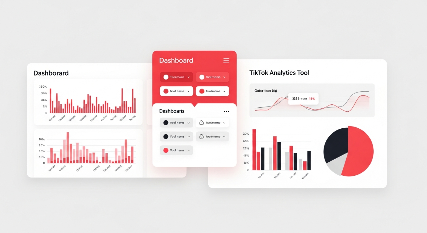
Part 6: Tools for Better Analysis
TikTok Native Analytics
Pros: Accurate, free Cons: Limited historical data, no pattern recognition
Best for: Basic weekly check-ins
Spreadsheet Tracking
Pros: Customizable, free Cons: Manual data entry, time-consuming
Best for: Creators who want full control
Noodle
Pros: AI-powered insights, pattern recognition, retention analysis, automated recommendations Cons: Paid for full features
Best for: Creators serious about data-driven growth
What Makes Noodle Different
Unlike tools that just show you numbers, Noodle answers questions like:
- “What do my top 10% of videos have in common?”
- “Where exactly are viewers dropping off?”
- “What hooks work best for MY audience?”
- “What should I post next based on my patterns?”
Common Analysis Mistakes
Mistake 1: Only Looking at Views
Views are the most visible metric, but they’re often misleading. A video can go viral to the wrong audience and actually hurt your long-term growth if those viewers don’t engage or follow.
Better approach: Prioritize completion rate and follower conversion.
Mistake 2: Reacting to Single Videos
One video flopping doesn’t mean anything is wrong. One video going viral doesn’t mean you’ve cracked the code. You need trends over 10+ videos to draw conclusions.
Better approach: Analyze in batches, not individual posts.
Mistake 3: Comparing to Other Creators
Someone with 1M followers has completely different benchmarks than someone with 10K. Comparing yourself to them is meaningless and discouraging.
Better approach: Compare yourself to your past self. Are you improving?
Mistake 4: Ignoring Qualitative Data
Numbers don’t tell the whole story. Read your comments. What are people saying? What questions are they asking? What do they want more of?
Better approach: Combine quantitative (numbers) with qualitative (comments, DMs).
FAQ: TikTok Analytics
How often should I check my analytics?
Weekly for strategic analysis. Daily if you’re running a specific test or campaign. Avoid constant checking—it leads to emotional reactions and poor decisions.
My views suddenly dropped. Should I panic?
No. View fluctuations are normal. Only worry if the decline persists for 2+ weeks. Single-video or single-day drops are usually algorithm testing variations.
What’s a “good” engagement rate on TikTok?
TikTok engagement rates are higher than other platforms. Average is 5-8%. Good is 8-15%. Excellent is 15%+.
How long should I track a video’s performance?
Most TikTok videos get 90% of their views within 48-72 hours. However, some videos get a “second wave” days or weeks later. Track for at least 7 days for full picture.
Should I delete underperforming videos?
Generally no. Deleting can signal to the algorithm that you produce low-quality content. Only delete if a video violates guidelines or seriously damages your brand.
Your Analysis Action Plan
Today:
- Set up a tracking spreadsheet or Noodle account
- Calculate your baseline metrics from the last 30 days
- Identify your content pillars
This week:
- Analyze your top 3 and bottom 3 videos from the last month
- Write down 3 patterns you notice
- Set one specific improvement goal
Ongoing:
- 30-minute weekly analysis every Sunday
- Monthly pillar review
- Quarterly strategy adjustment based on learnings
The creators who grow consistently aren’t necessarily the most talented—they’re the ones who learn fastest from their data. Start analyzing like a pro, and you’ll start growing like one.
Ready to get AI-powered insights on your content? Try Noodle free and see exactly what’s working in your videos.
Related Reading: